London Tubemap
Introduction
I’ve lived in London most of my life and take the Tube Map for granted, but as a designer, I’ve listened with interest to friends from outside London and overseas saying how confusing they find it. The major criticism being that it bears little or no relation to London at street level.
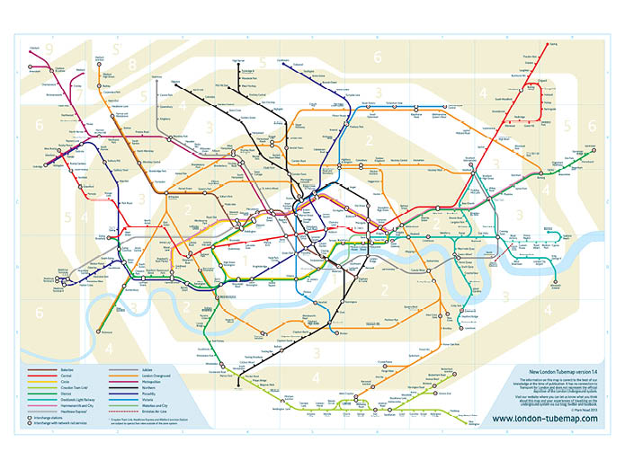
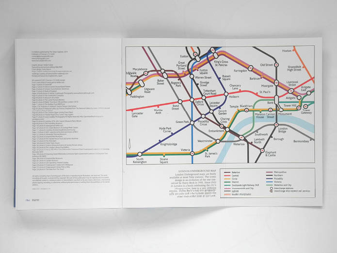
The original London Underground diagram, designed by Harry Beck is one of the greatest designs of the twentieth century. He rationalised and clarified a complex system to produce a simple, easy to follow piece of information graphics. Over the years, the Underground system has grown and now has twice as many lines as there were on the last version Beck worked on in 1960. The current version still looks similar to his original work but, although it follows the same principles, these have not been applied with any great care.
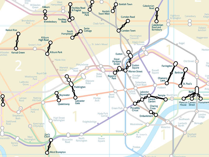
If Harry Beck saw the current diagram, I don’t think he would be happy to put his name to it. Newer lines have been shoe-horned in with stations pushed and pulled around in what seems more of a space filling exercise than an attempt to communicate clearly and effectively. Yes, Beck did compromise geographical accuracy to create a clearer, simpler diagram but the subsequent updates have exacerbated this with some quite dramatic liberties being taken with the position of stations. The addition of the London Overground network in particular has thrown up some laughable juxtapositions of stations, Watford and Watford Junction, Archway and Upper Holloway, South Acton and Chiswick Park are all seriously misleading.
And of course there was the short-lived experiment of removing the river Thames, the only ‘geographic’ feature on the map.
So I wondered what Harry Beck might do if asked to start again with the different parameters we have today:
– more lines and upcoming additions including Crossrail, the Docklands Light Railway extension and the Northern Line extension to Battersea;
– the Docklands Light Railway and London Overground moving the emphasis away from the Circle Line loop;
– developments in technology meaning it is just as likely to be viewed on-screen as it is in print; and
– many more visitors from outside London.
Development
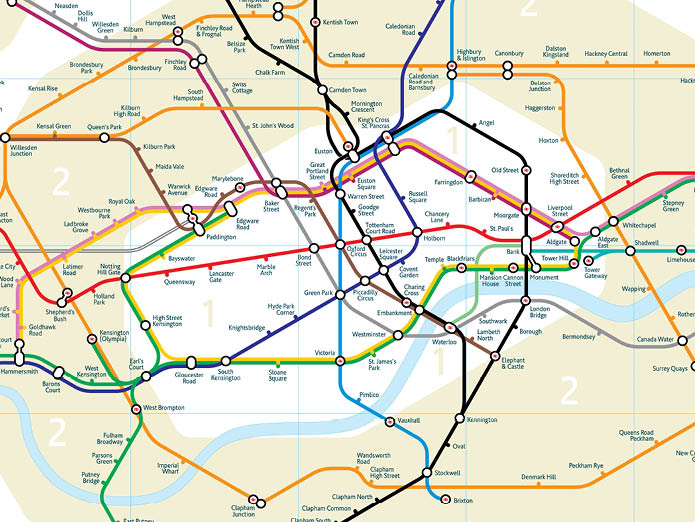
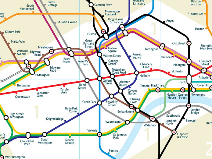
A truly geographic representation of the London Underground system is not practical to use as a navigation tool. The system covers a huge area but the majority of stations and the most important interchanges are located in a small central area. To be successful, the new version needed to reflect the geographic relationships of the stations to each other and to London as a whole but also be easy to read and usable to plan journeys.
Beck’s map was not wholly original. Diagramatic representations of the lines already existed in different forms, the colours of the lines and the way stations and interchanges are identified were already standard so his map, although radical in shape used a visual language already familiar to users of the system. In the same way, I wanted to use the existing visual language for the lines and stations and also to follow similar design principles, in particular the fixed line angles and shortening the extremities of the lines to make it more compact.
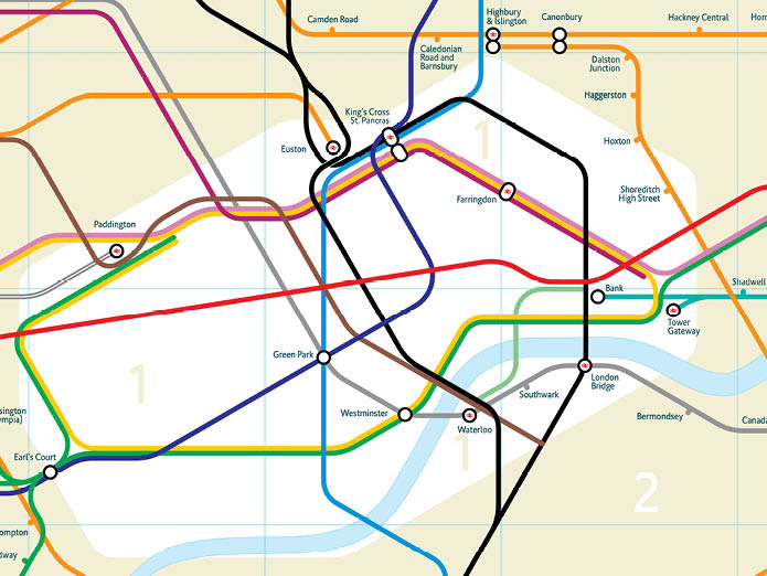
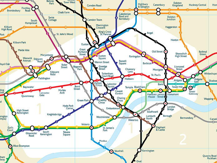
To plot the position of the stations, I used a combination of true geographic representations of the system found on line, Google maps, and a battered old copy of the London A to Z street atlas. Once plotted, the main design task was to establish the angles and to create a grid. Through the central area, the Jubilee, Bakerloo, Northern, and Piccadilly lines all run roughly parallel at 60 degrees from the horizontal so this was my starting point. The map uses vertical, horizontal, 60 and 30 degree lines throughout, just one more angle than Beck’s horizontal, vertical and 45 degree system.
The stations are positioned so they are geographically correct in relation to each other, for example: Waterloo is east of Westminster; Cockfosters in north of Bond Street; West Croydon is south of Elephant and Castle and Upminster is further north than Uxbridge. However, the lines do not follow all the actual twists and turns. These have been drawn to make navigating between the stations as simple as possible.
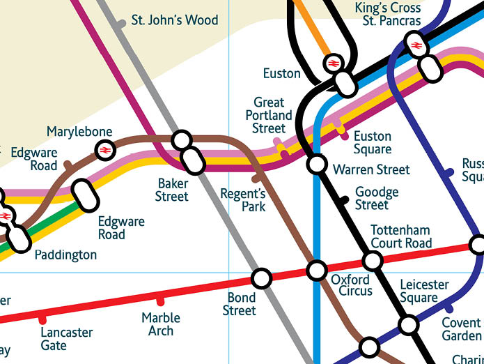
One of the most familiar elements of the underground map is the typeface Johnston (or Johnston Sans) which is also used for signage throughout the system as well as on the London Bus network. I wanted to keep the typeface as another familiar element from the existing map but, the geographic positioning of the stations on my map means that some of them are quite close together making it difficult to add the station names. What I needed was a condensed version of the New Johnston so I commissioned type designer Dave Farey to create a new font that has many of the characteristics of Johnston but also removed some of the quirks of the original to improve legibility. The single weight of New Underground as it was christened is used throughout the map and promotional material.
Launch and reaction
From the first sketches to the launch of the website was just under a year involving many redraws, tweaks and refinements.
Publishing in web and app format gives the opportunity to add more layers of information to the map without making it overcrowded. Layers currently available include: step-free access; journey times between stations; river bus services; and useful walking links between stations at street level. There are plans to add many more and to include individual station directories to give more information at each location for example the number of steps, escalators or lifts, toilet facilities, bus links, local attractions etc.
Facebook and Twitter were very useful for spreading publicity about the map. Once started, the story was picked up by many on-line magazines and blogs and also by the conventional press. Notable coverage included: press articles in London’s Metro newspaper, The Independent, Intersection magazine and Swedish daily Dagens Nyheter; on line coverage from The Economist, The Toronto Star, Dezeen, Travel + Leisure (New York), and Juxtapoz (San Fransisco); and an interview with BBC Radio Kent.
An article on the Fast Company (a New York based style magazine) blog generated particular interest. It received a comment from Erik Spiekermann, designer of the Berlin underground map and typeface Meta among others, that generated a follow up article about ‘what design means’ (www.fastcodesign.com/1664692).
In general, the responses were split between those who like the new geographic approach and those that consider the existing version such an icon it should not be messed with. However, in defence of the existing or ‘classic’ map there seemed to be three main lines of thought which can be summarised as: it’s ugly; if it ain’t broke don’t fix it; and you don’t need to be geographically accurate when you are underground. I have no problem with criticism, it helps make a better map, but there are a few points that need to be made in response to these comments which will hopefully add to the debate.
The relative aesthetic qualities of the two maps is an interesting one. There have been as many comments for – ‘beautiful’, ‘very sexy’, ‘ This may be the best piece of design I’ve ever seen’ – as there have against – ‘an ugly waste of time’, ‘looks like it’s been dropped’, and ‘aesthetically frightful’ (the most eloquent thanks to actor and writer Mark Gatiss). Maybe aesthetics should have been higher up my priority list when designing it but it really was about finding the clearest solution as was Beck’s original which is equally ugly and beautiful in its own way.
It ain’t broke? As reported previously, I am a fan of Beck’s original map and in no way claim to have produced something that is better than his but the current version does not come up to his high standards. Those that defend the current map in Harry Beck’s name are really not looking at it carefully enough; there is room for wholesale improvement within those design parameters. The problem with anyone independent trying to improve it is that they would be unlikely to be able to publish it because of TfL’s copyright enforcement. And those responsible for the current map don’t seem to understand or care about the rigour and quality Beck applied during the 30 years he was responsible for the map.
As for not needing geography underground, that is probably true. But recent additions to the system, London Overground (the clue’s in the name), Docklands Light Railway, and Croydon Tramlink are all on the surface. In 1931 (Beck’s original) less than half the system was underground anyway; the proportion is much less now.
What next?
There I some refinements I would like to do to the London map in particular to improve the way intersections are identified, I will also be adding a layer showing all the National Rail services covered by the Oystercard system.
But I would also like to do much more with layering and customising the map for use on screen, I want to change the way you access information from a map. My aim is to create a map that you can customise to your own requirements using filters for the whole map and individual station directories.
There is still much to do and it will be an ever-changing project. What’s important is how people use it and understanding what works and what doesn’t, what’s needed and what is irrelevant. In that regard, feedback and comment from users of the map is its most valuable asset.

Step-free access
Journey times
Walking links
Caption text9
The Tubemap appears in the Analogue Guide to London
It is also in the Only in London guide by Duncan Smith
11 - 11
<
>
Press coverage
Fast Company 1
Fast Company 2
Creative Review
The Independent
Dezeen
The Economist
The Toronto Star
The Los Angeles Times
Related posts:
Paris Metro Map