Designing the 20th Century:
Life and Work of Abram Games
The Jewish Museum London
This review first appeared in Forum issue 29
Abram Games is rightly considered one of the most important and influential graphic designers of the 20th Century and this comprehensive exhibition includes many of his iconic works. Seeing these familiar images up close is of course wonderful but what I found memorable and informative was the way the work was presented as part of the overall narrative of his life.
Games was born in the East End of London on the second day of World War One, the son of Jewish immigrant parents. He was obviously a talented artist as an early portrait in oils of one of his grandparents demonstrates. He also had a good understanding of technical production processes picked up working with his photographer father.
Games studied at St Martin's School of Art but, disillusioned by the teaching, left after only two terms. He taught himself how to use an airbrush and put together a portfolio of speculative work that he hawked around London agencies. This single-minded determination, evident throughout his career, paid off landing him early commissions.
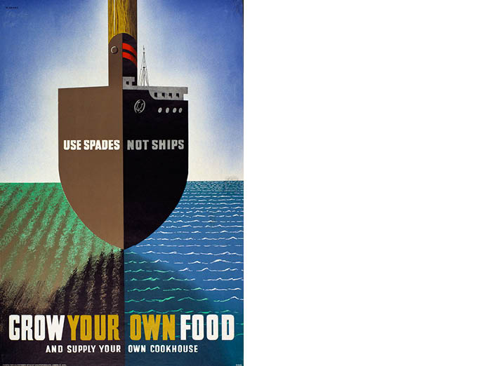
His work was strongly influenced by the Bauhaus and Constructivism and this comes through in the formal rigour of his designs. But he was also influenced by another art movement, Surrealism. This encouraged him to experiment with combining incongruous objects to create striking and memorable images as with his brilliant ‘spades not ships’ poster. His own mantra was ‘Maximum meaning, minimum means’ and this simplicity of form characterises his work.
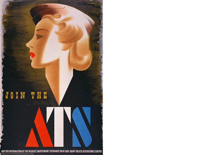
Looking through the examples on display, it is clear that Games made no distinction between the typographic and pictorial elements of his work. The letterforms, for the most part hand drawn, are integral in the overall design of the image. In his 1941 ‘Join the ATS’ poster (banned by Parliament after five weeks for being too glamorous despite attracting more recruits than any other poster) the angles of the type mirror the neckline of the figure. The Displaced Persons poster c.1946 has the initials DP imitating bars in front of the terrified face. This image in particular shows his mastery of the airbrush which captures the haunting expression.
The 1976 poster Games produced for Lond0n Transport to promote London Zoo also demonstrates this combination of type and image with the word Zoo and the tiger both being rendered in the same style. It also shows the move away from the graduated tones of the airbrush to the use of flat colour. In the early 1960s, improvements in the printing process made it much easier to use photography. Games recognised this would reduce the need for his tonal illustrations so moved to flat colours as he felt this would compete more effectively with the new technologies.
The London Zoo poster was one of several that were displayed alongside the original sketches in pencil and gouache and, in this case, the artwork drawing prepared for the printer. This for me was the most valuable part of the exhibition. To see ideas develop from rough sketches refined through presentation renderings to the final printed work is always enlightening. And to see the painted sketches for one of my favourites, his 1962 ‘Freedom from Hunger’ poster for the United Nations displayed on Games’ original easel with paints and brushes was a real treat.
The show was curated by Abram Games children using material from the family’s archive which provided a valuable, personal supplement to the more familiar works. There were also some less well known exhibits in particular his work for the Jewish Chronicle and some wonderfully expressive calligraphy.
Games did some great work for commercial clients, notably Guiness, The Financial Times, and the world’s first moving tv ident for the BBC. But this exhibition left me in no doubt that he was happiest working for clients and causes that really mattered to him. He understood that great design can change opinions and influence society. He neatly sums this up as follows: “We badly need fine ideas, fine feelings, fine values expressed through fine design.” Something we should all aspire to.
1 - 3
<
>